Over the last decade, World of Dance has undergone an immense amount of growth and change, from a single event in 2008 to what is now an international event tour and television show. Our intention to form a diverse and powerful dance community has always remained the same. Visually, we’re always trying to make sure we’re representing who we are with our logo. And oh man, how the World of Dance logo has changed over the years.
The Very First World of Dance Logo
Our very first logo was created and used in 2010. Initially, World of Dance logo creators focused on generating an image that conveyed how much we wanted our brand to reach beyond the California dance scene. What better way to demonstrate how we wanted to reach out to dancers across the world than to use a globe as the “O” in WOD?

Moving to a More Urban Look
World of Dance rebranded in 2013 in an effort to reflect the audience we had gained. Our creative team drafted a logo that revealed the street-style, urban scene that WOD events had evolved into. This rounded, futuristic looking logo inspired product/clothing designs and sparked international brand recognition.

The World of Dance Logo on NBC
After being licensed for a television show with NBC, the WOD logo underwent another rebrand. The 2017 edition logo was a stepping stone to gaining recognition as World of Dance, rather than our beloved acronym WOD.

NBC World of Dance and WOD Event Tours Become One
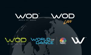
WOD events and NBC World of Dance were once seen as two separate entities. Currently, we are working to merge our two worlds. World of Dance has chosen to unite as one brand with the same core values, giving dancers the opportunity to be a part of a community that celebrates their artistry and appreciates authenticity.


